The art of Mexico is known for bold and bright colors. But that goes way beyond paint on canvas – and even the boundaries of Mexico itself.
The colorful imprint of Mexican art is particularly prominent among the diaspora in the U.S. when paired with another art form – that of the culinary kind.
Taco journalist and James Beard Award nominee Mando Rayo knows all about it. He spoke with the Standard about the thought and talent that goes into the hand-painted art of Mexican eateries on both sides of the border. Listen to the story above or read the transcript below.
This transcript has been edited lightly for clarity:
Texas Standard: “The Art of the Taco.” What have you learned and observed in all these years of eating in Mexican restaurants? When I say that, I know you learn a lot, but there’s a lot about the look and the art that goes with it.
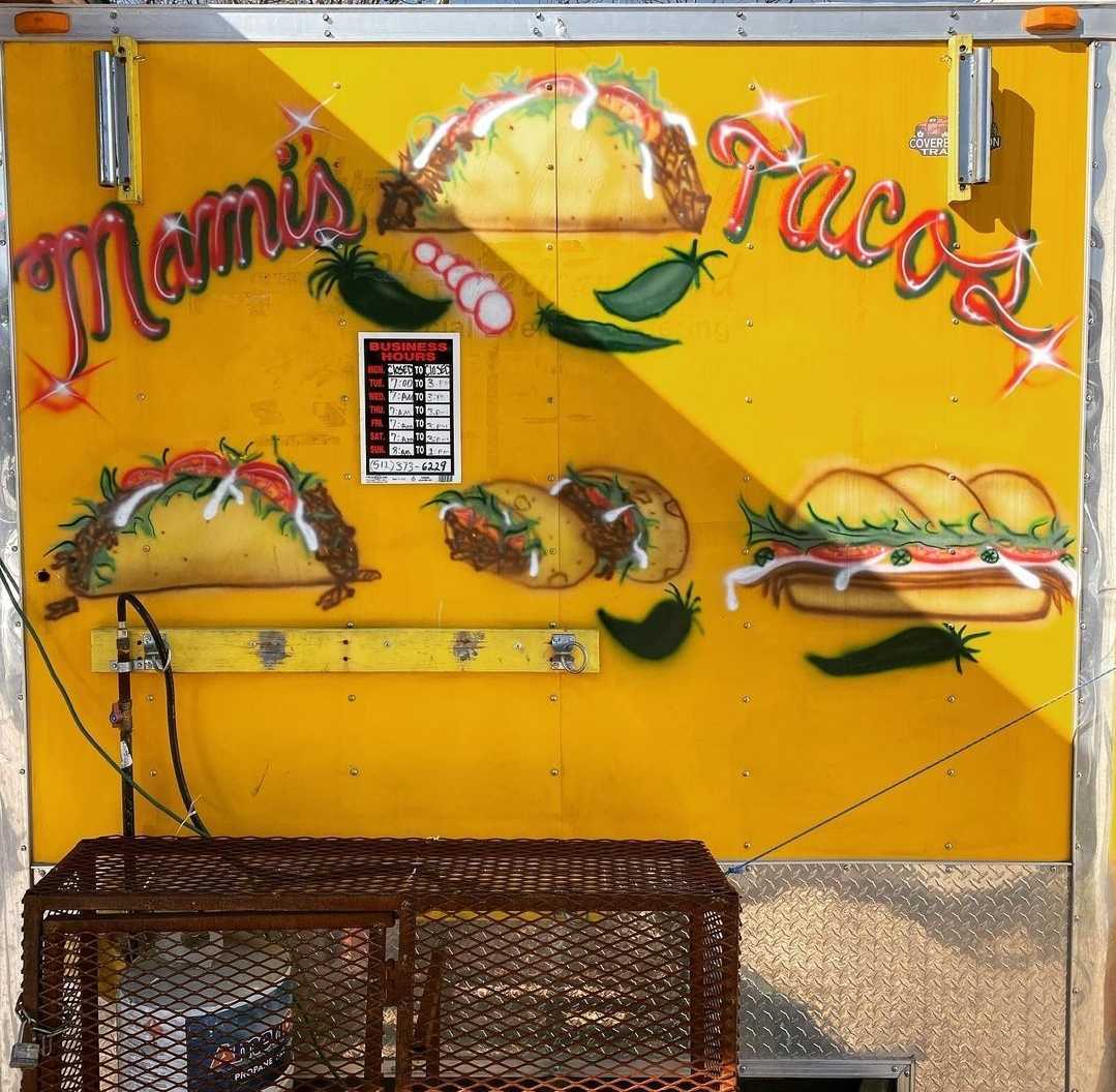
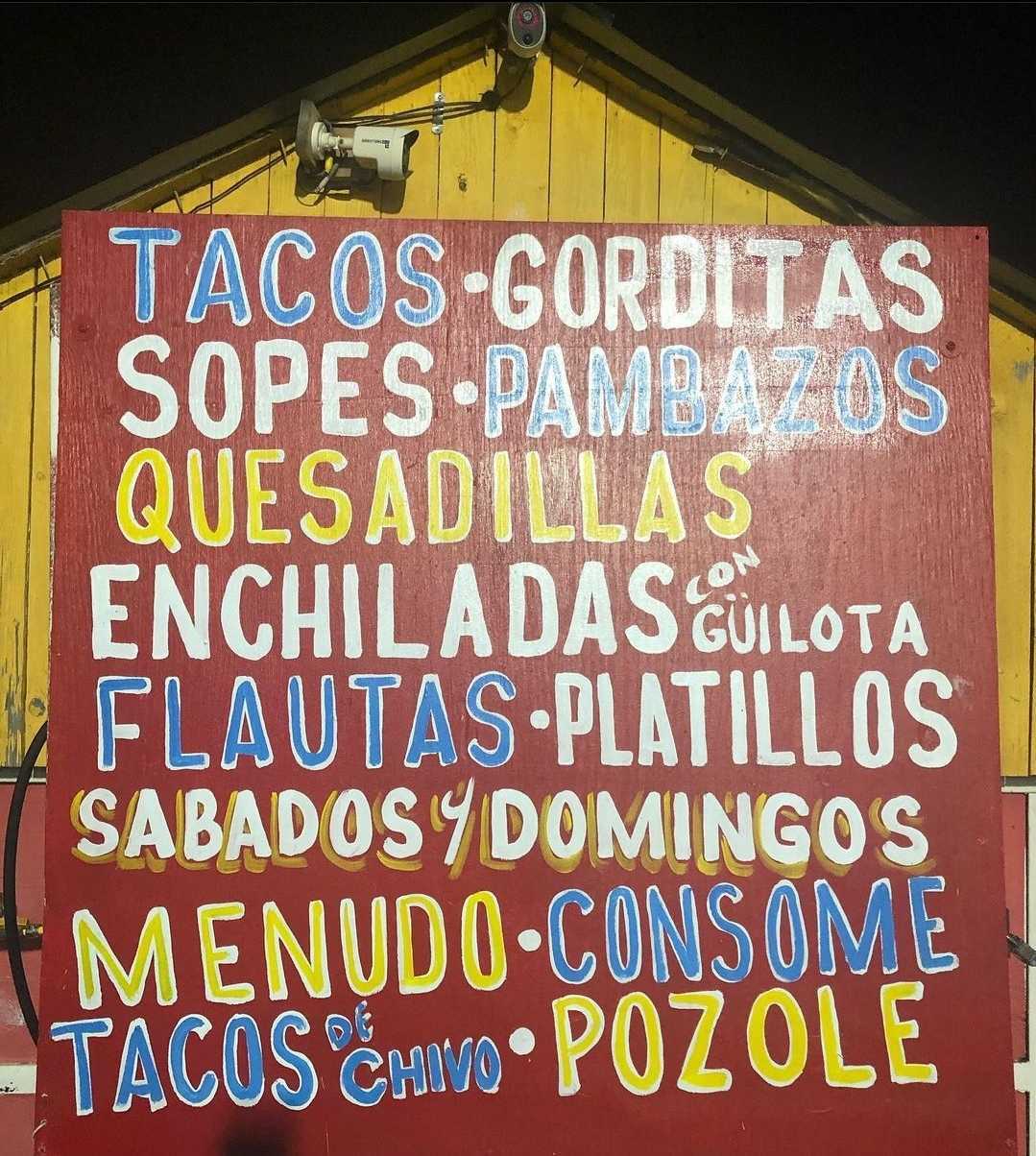
Mando Rayo: Yeah. I mean, we’ve been kind of tracking this for a very long time. We call it #tacofont. So we did this whole idea around the art illustration, the fun that goes into creating signs or painting a truck. And all of this kind of is really rooted in an art style called “rótulos,” which are, you know, signs that you see in Mexico. You could see them across, say, a building. Definitely signage for food. It’s kind of that handwritten style of painting, you know, whether it’s a truck or menu items.
“Rótulos.” Is there a direct translation of that?
So, you know, “rótulo” is a sign, roughly. Like, you know, a rough translation. But the idea around that is that handwritten approach to the sign, right?
Almost like folk art in a way?
Yeah. You could call it that. It’s definitely more, you know, at the street level where you don’t have big budgets to hire a graphic designer, but you have a cousin that has great penmanship.
I think I know what you’re talking about, because I think I’ve seen this at the street level, and it’s highly prized, too. Sometimes you have people who try to imitate it – it doesn’t quite work. But it’s very highly stylized. And when it’s authentic, you definitely you can tell.
Yeah, if it’s too glossy, too shiny, too perfect, yeah, you kind of get that. And the best rótulos are the ones that, you know, they’re done once and they have wear and tear, but they also use bright colors to attract, say, customers at a taco shop or a taqueria or taco truck. You know, I mean, think of the Mexican flag: the green, the red and the white that really kind of stand out. And when you’re, you know, passing by and you’re like, “oh, I see a big sign – a rótulo – that says ‘barbacoa,’ I’m going to stop by right there because it’s in bright green.”
Well, now we should point out that there is absolutely a difference in how Mexican food is marketed to customers when you compare, say, small taquerias. And, you know, if you’re in South Texas, if we’re talking about one of these larger brands – Taco Palenque or Taco Bueno, you know, which is all over the place now – this is almost like something that a lot of taquerias that are not authentic try to emulate to give it more of a real feel. Right?
Yeah. I mean, you do see that a lot. I think what’s missing once you get there is the vibe and the culture. And while they could mimic some of those illustrations, once you get there, you know: “Oh, wait a minute. I’m just in a fast food chain.”
Well, this even goes into how the menus are presented. It’s not just the exterior signage or some of the interior things. I mean, I think we all know of a place that comes to mind where there are plenty of photos of the plate of food on a laminated menu, right?
Oh, yeah. I mean, you know, that’s the easiest thing. When you’re starting your own business, your own restaurant, your own food trailer, I mean, what you spend on matters. You’re not going to spend a lot of money if you don’t have it, on a fancy sign or anything like that. But hey, you know, I have a paper, I’m going to put my menu on it with some bright colors, laminate it, and now we’re set for a few years.


